HOOQ Progressive Web App
This project in 2018 was a zero-to-one implementation which involved a lot of cross-functional collaboration.
My role
Facilitated design sprints which produced actionable outcomes
Influenced product strategy by producing a customer experience map that presented opportunity areas
Designed the mobile web design language system from scratch
Designed in-product visual and interaction experiences
Produced high-fidelity prototypes for testing with customers

About HOOQ
HOOQ was a video streaming platform operating primarily in Southeast Asia and India. In 2018, one of its unique value propositions was being a platform that had a strong catalog for both local and Hollywood content.
As a platform capitalized by one of the largest telcos in Southeast Asia, one of the main acquisition strategies was bundling a HOOQ subscription together with any purchased prepaid data plans.
People problem
I want to conveniently find a place where I can watch great local and Hollywood video content.
Business problem
The conversion of pre-provisioned customers was only at less than 1%. How might we increase the rate of pre-provisioned-to-activated customers? We only had an app to drive activations and a static desktop site. How might we increase our conversions across more channels?

Who are we designing for?
Emerging market customers
Majority of HOOQ’s customer base were from Indonesia. They consume a lot of video content primarily on their mobile device.
Mobile data conscious people
These users are very conscious with their mobile data. A value proposition for them are data bundles with a separate video data limit.
Value-for-money individuals
HOOQ subscriptions are bundled with prepaid data packs. HOOQ is considered a value-added service for them when purchasing data bundles and they’d want to make the most out of it.
Cost-Efficient device users
Our current data showed most of our customers were on more affordable Xiaomi phones on Android.
Discovery through a Design Sprint
I facilitated a Design Sprint so we could collectively understand our current ecosystem. It was a team comprised of members from Engineering, Marketing, Product Management, Data Science, Business Development, and Leadership.
App size problem
The conversations we had in the Design Sprint made us realize our app size was a big issue. Customers wouldn’t activate because they wouldn’t want to spend a large portion of the mobile data bundle that they’ve just purchased on downloading a large app.
This led us to believe there’s a lot of opportunity in providing an alternative means of activation of their pre-provisioned plan—routing through mobile web or a progressive web app.


Measuring success
To validate the efficacy of our solution, we’d track its impact to the following:
Pre-provisioned activations
Organic activations
Playback events
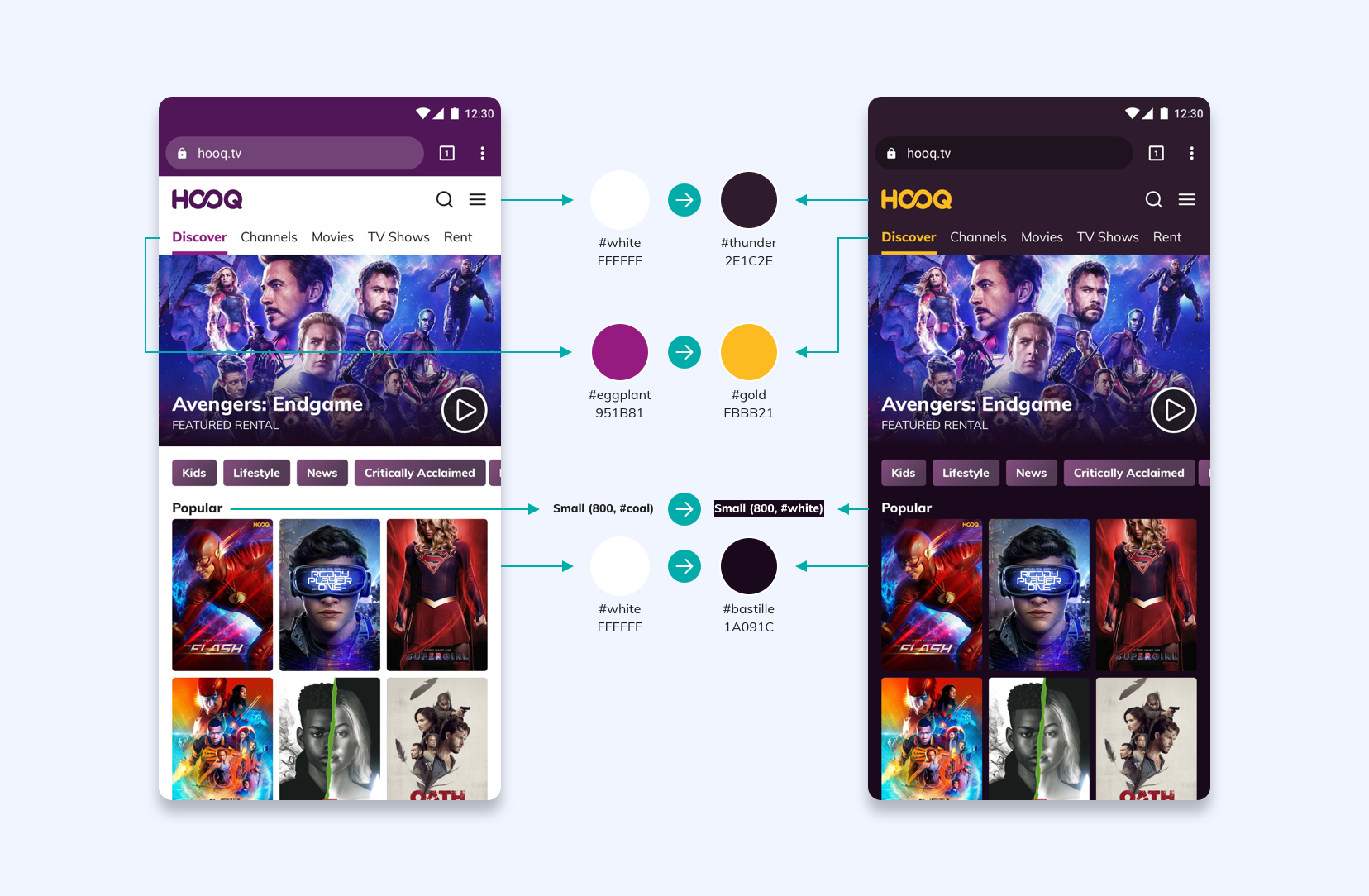
Developing our design language
I collaborated with software engineers to influence the development of HOOQ’s mobile web design language system. There was a desktop-only web site but it could not scale to the needs of mobile web. Most of the fundamental elements had to be created from scratch.
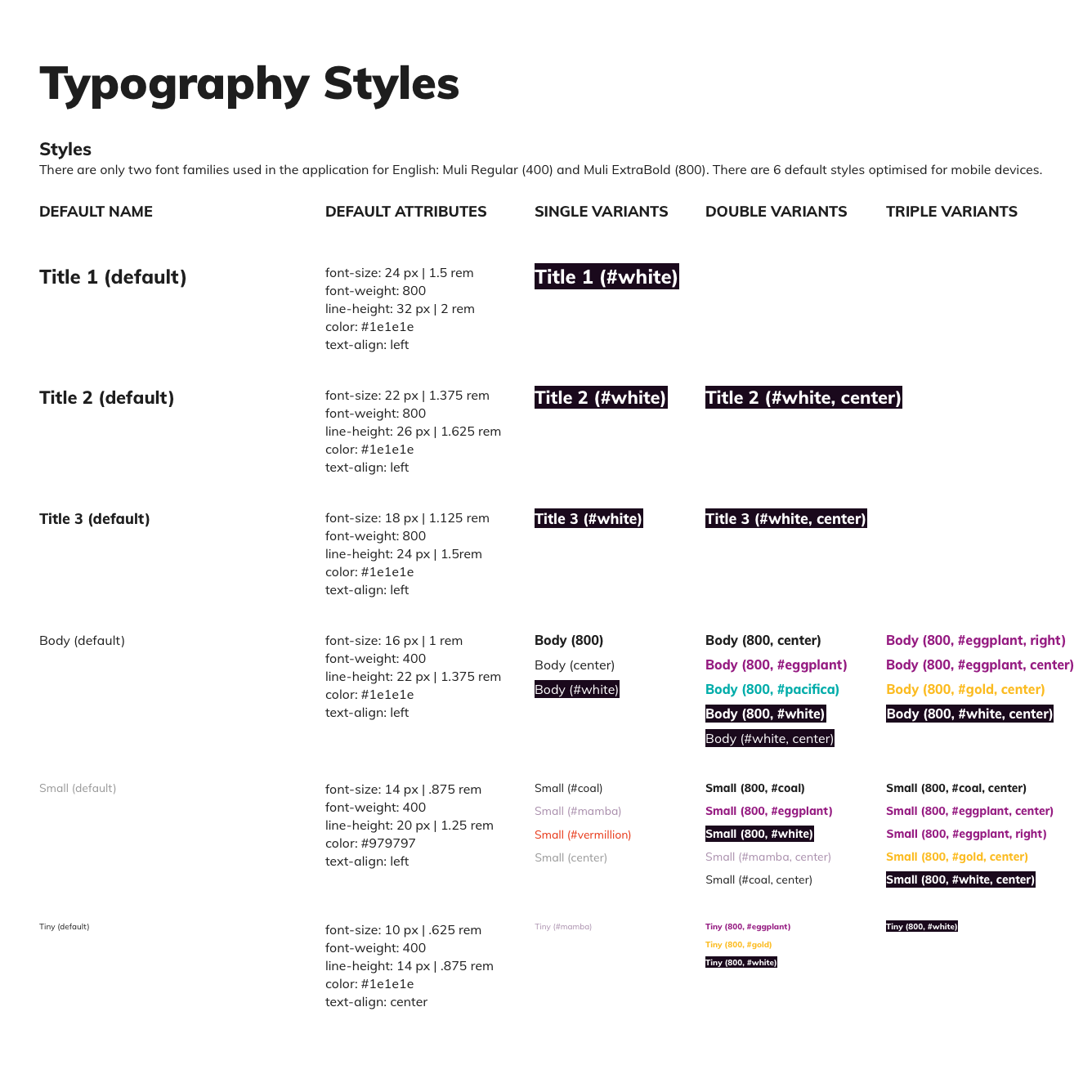
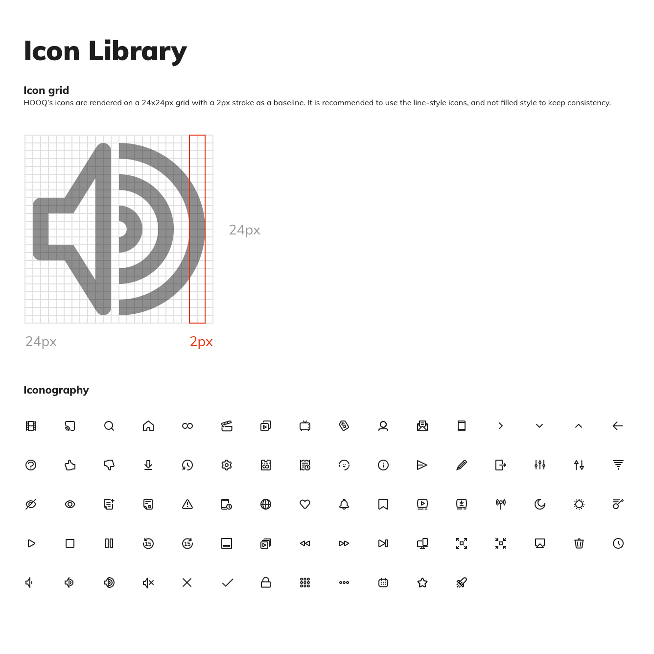
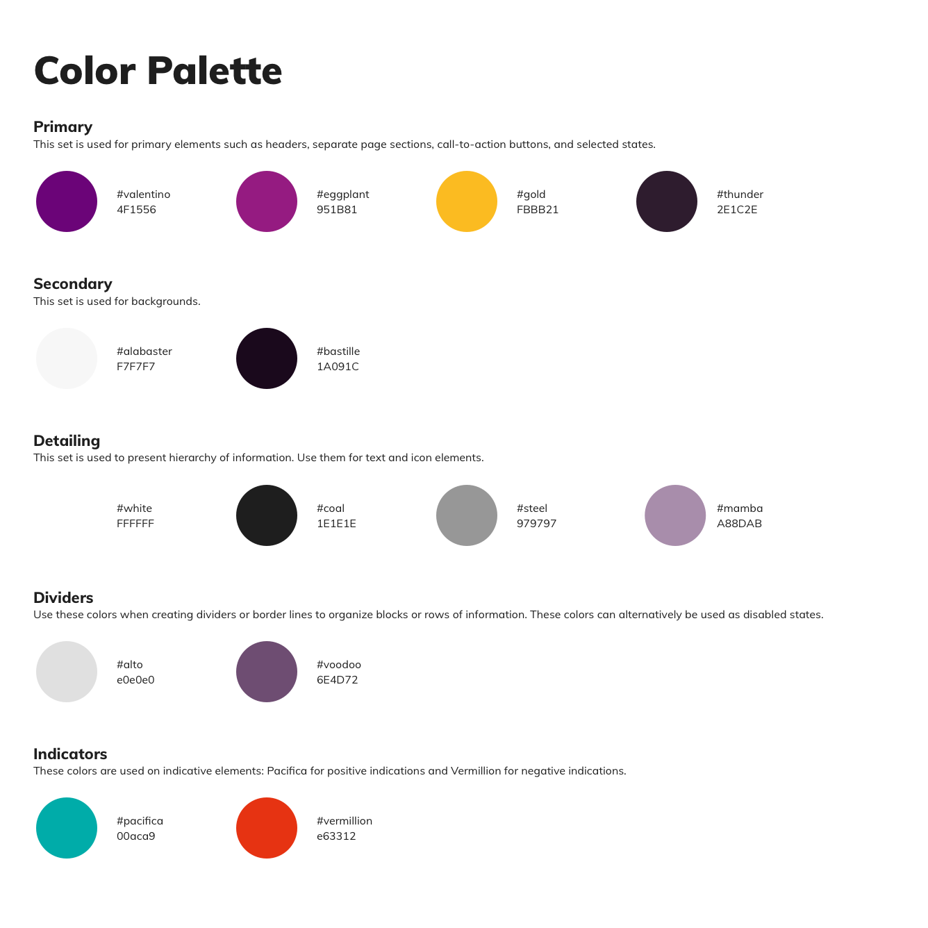
An important visual design consideration was how different themes would translate depending on user preferences. I created corresponding colour swatch pairs for both light and dark themes.
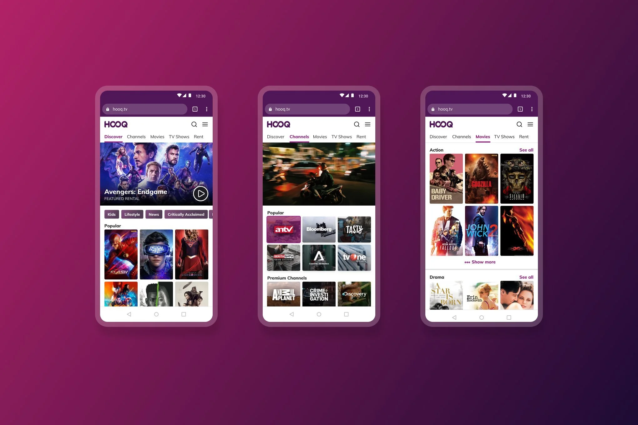
Defining design patterns
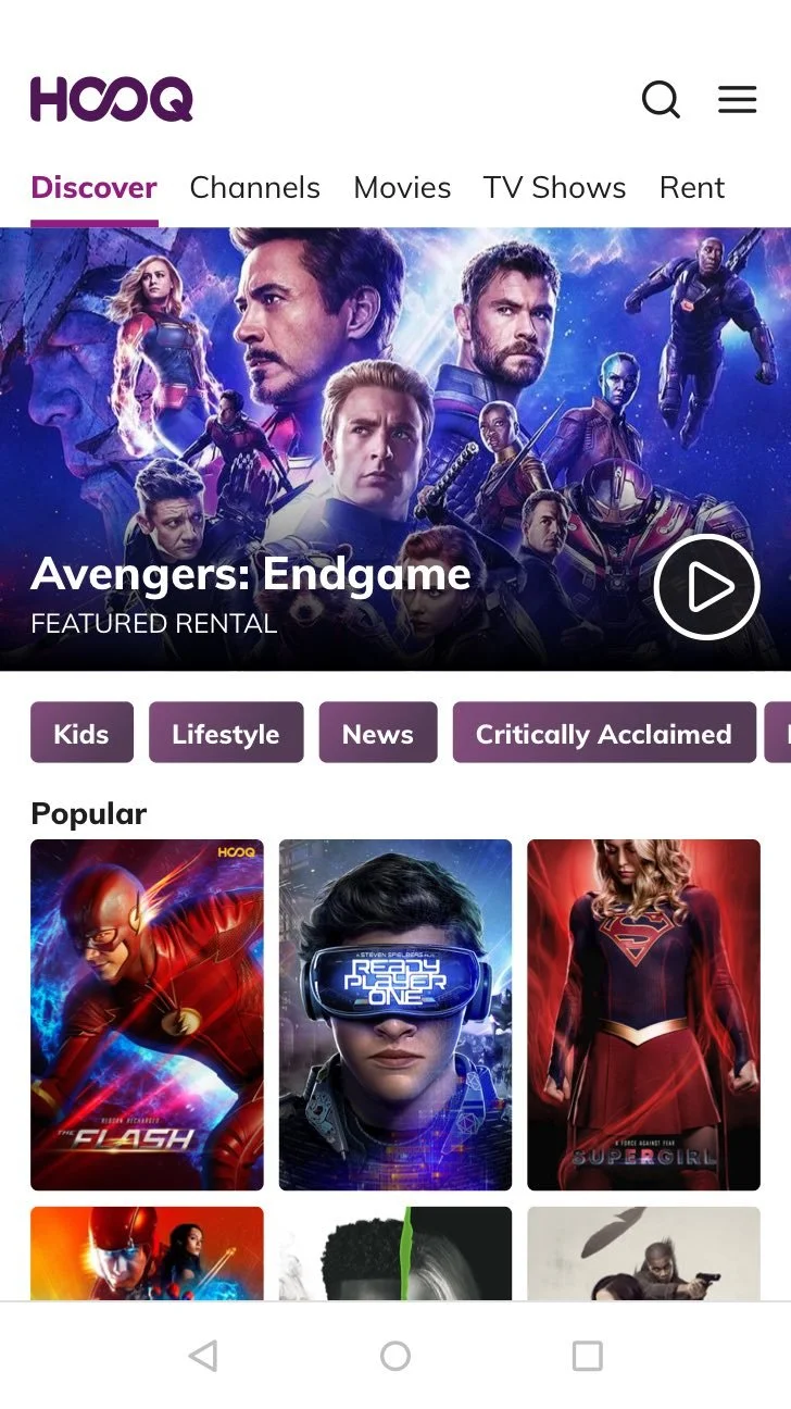
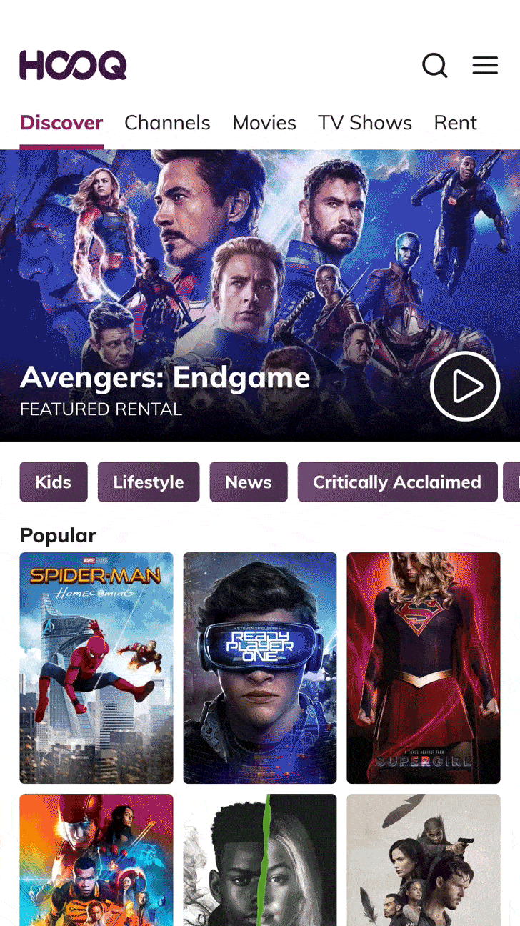
Once fundamental elements have been crafted, these are put together to make HOOQ mobile web’s design patterns. Below are some options I crafted for common design patterns.
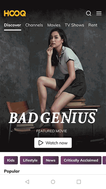
Spotlights
Spotlights are the full width banners that feature the latest/popular content. I prototyped 2 options: “Massive” and “Conservative”. Some customers felt the massive banners occupied too much space.
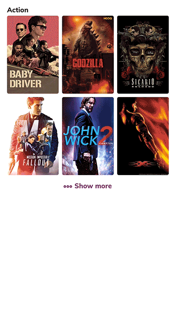
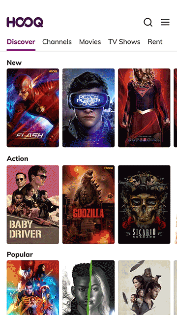
Collections
Collections are used to curate a group of titles into one genre or theme. I prototyped 2 options: “Expandable” and “Rail”. We got mixed feedback as to personal preference between both options.
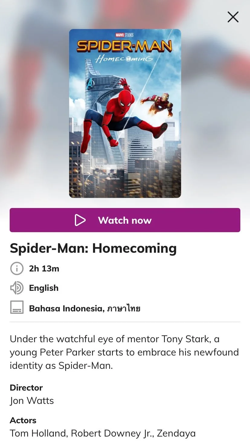
Title details
We explored quick view window components that allow customers to see details without having to leave the main “Discover” feed. Usability tests we did on this screen showed customers liked being able to clearly see available dubs and subs options.
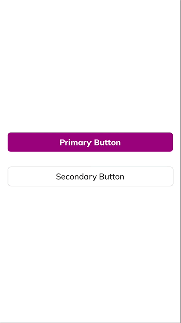
States
These are some of the states for page and button loading patterns.
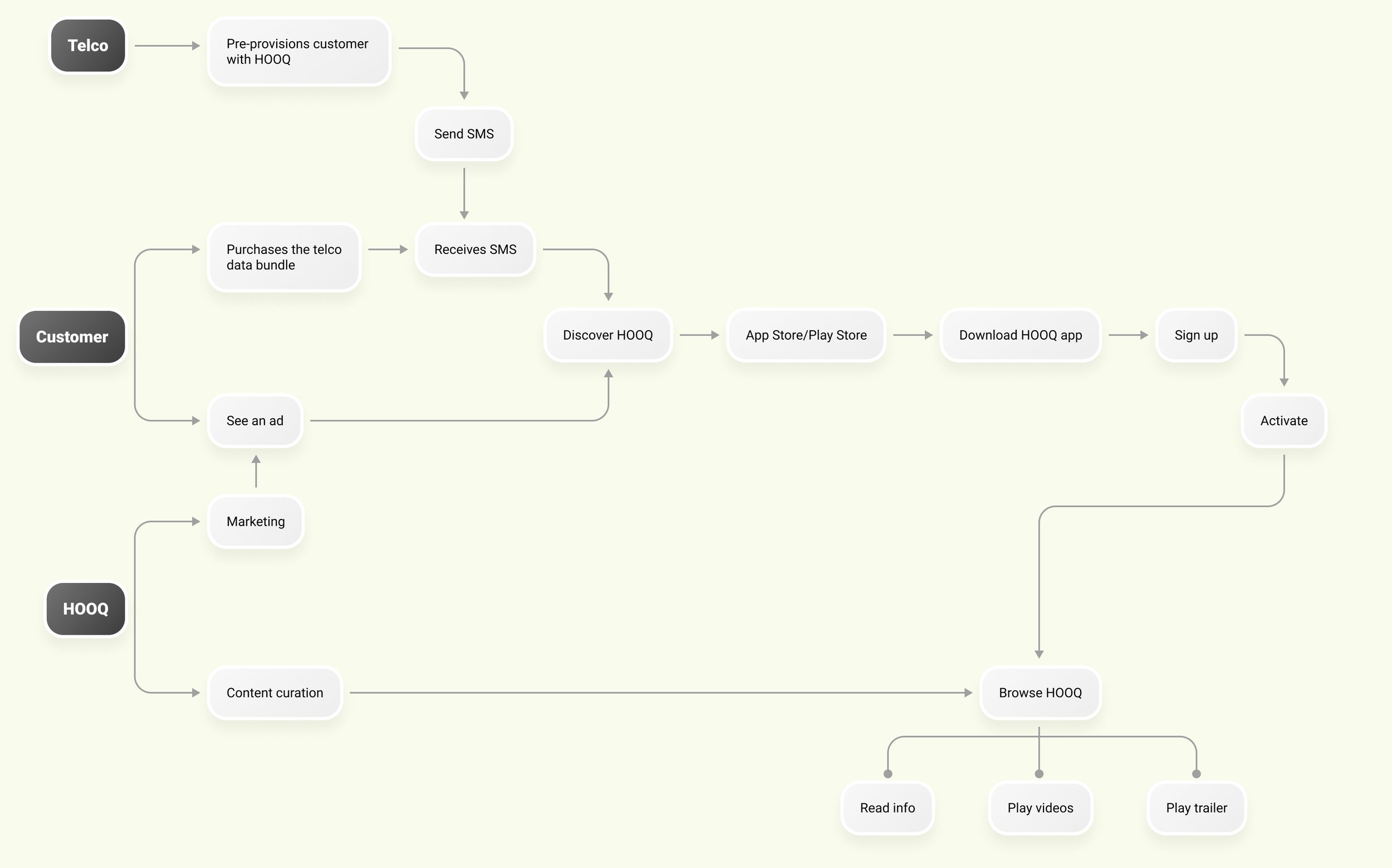
Screen flows
What sets the mobile web experience apart from the native mobile app are these core flows:
Open catalog
The current app required you to sign up before you could even view the content. We intended this platform to be browsable & even have unregistered users watch some content.
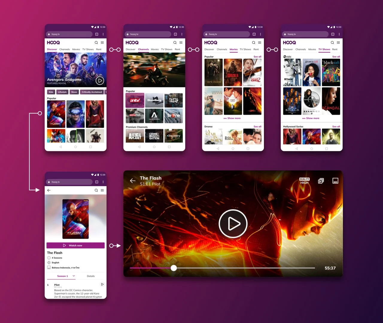
Contextual call-to-actions
We wanted the “Sign up” call-to-actions to be non-intrusive and made available at the point where users would have more incentive to go for it.
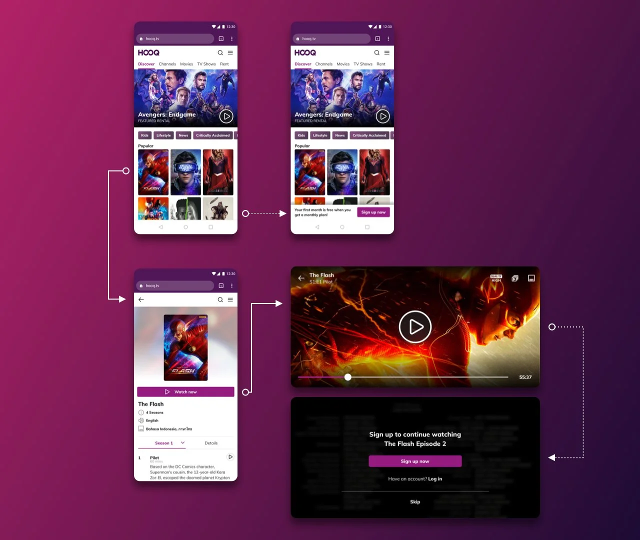
Deferred Sign Up
The sign up flow comes in when customers have been more incentivized to do so. At this point, it is assumed they’ve already browsed the catalog and might have watched free content.

Outcomes
What didn’t go well?
We couldn’t redirect full traffic for activation to PWA yet—there were some missing telco integrations that prevented us to redirect full traffic to PWA for activation
SEO could have been better
Identifying which content was free to watch as an anonymous user was a challenge since we had to consider licensing stipulations
What went well?
Pre-provisioned activations on mobile web surpassed iOS by ~7%—some customers also organically activated via mobile web
Playback events—Users were actually watching videos on PWA
Sorry for the long post. Here’s a couch potato. Yes, this is a 9gag reference.